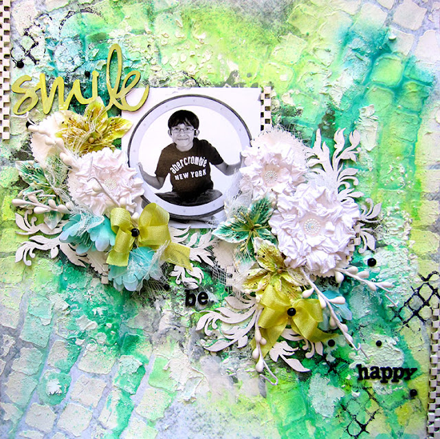
This is my second layout for this month's reveal at 13 Arts. It is also bold and bright like the other one but with a different colour scheme.
I built my background on top of the "Spring Morning" paper from the 13 Arts "Faces of Spring" collection. However, after applying all the mediums, you can only see a glimpse of the original paper underneath. I do have to say that the 13 Arts papers are of amazing quality. They hold up so much wet mixed media without ripping.
To start off, I created a stone like pattern in the background using a new Prima stencil and masking it with 13 Arts Modeling paste. Then I spread (generously) 13 Arts Glass filler microbeads all over the wet medium.
I started spraying the page with three different chalk mists from 13 Arts: Yellow Lemon, Celadon and Sap Green. I let the ink drip down the page by spraying it with water to dilute the consistency. I also used some "almost dry" 13 Arts Primer from the edges of the jar. As we always have some hardened paste around the edges of the jar, I didn't want them to go to waste. Using a palette knife, I smeared them randomly on the page, creating a rough surface in my background.
I used Ranger black Archival ink and stamped a couple of different images on the page using two different Prima stamps. Then I embellished the page with 13 Arts flowers and stems. I also used Prima flowers and wooden icons, yellow seam binding, and black pearls.
The Chipboard pieces are from 2 Crafty. I used the Avery vines and the Scallop Circle Bunting to create layers on my layout. I simply primed them in 13 Arts gesso and left them white. The "Smile" title I sprayed in Yellow Lemon spray.
Finally, to highlight the background and to bring some depth into the layout I used some 13 Arts Pearl Black mist. I sprayed it on my mat and then, using a brush, painted underneath the embellishments.
13 Arts Materials:
Faces of Spring papers
Primer
Modeling Paste
Glass Filler microbeads
Chalk Ayeeda Mist: Yellow Lemon, Celadon and Sap green
Pearl black mist
White flowers
White stems
Other Materials
Prima flowers and wooden icons
2 Crafty Chipboard
Prima Mask
yellow seam binding
Ranger black archival ink
Prima stamps
Prima alpha
cheese cloth
Queen & Co black pearls
All 13 Arts Products can be found here
Have a Wonderful day!!


27 comments:
Gorgeous page, Love the mixed media in the back!
xx
Leila
Love this color combo and what a great page!
yummy Keren :)
Wowww beautiful work in the background, love it...hugs
Love the colors and the spray of flowers. Such a gorgeous page!
Bold, bright and absolutely beautiful, Keren - it's another wonderful composition, really dynamic and full of movement. The brick texture in the background is so cool too...
Alison x
Love this color combo and what a gorgeous page Keren!!!
Great design with the circle pattern matching your photo!
This is stunning Keren - your background work is pure eye candy!!!
Beautiful!! LOVING that textured background, the flowers and that sweet photo!!!!
Totally stunning!!!
Wonderful page! I loved it!
Great layout Keren... I am so loving your background job!!! Stunning! hugs...x
Wow, it's such an amazing lay-out! I really love your background and amazing flower clustering.
Oh wow. That background is eye-catching. Love the colours and the textures!
It's is spectacular sweets. Wow.
I love the circular feel to this page with the brickwork and the circle frame your son is looking through.
Fabulous creative LO Keren, love the circle frame ....
Oh yes! what a fab fab artsy page Keren! so many cool textures in the background work, LOVE the boldness of this!! xoxoxox
This is stunning, I love your brick work back ground and as always LOVE all the flowers.. and thanks so much for your kind words on my OUAS post too!!
Such a gorgeous page, Keren with so much amazing texture and dimension!! Thanks for your warm congratulations on my making the Helmar DT! ~ Blessings, Tracey
Garden of Grace
really cool, awesome page!!!!
Stunning layout Keren <3 I love the colours, textures and everything!
Absolutely gorgeous! Your clusters are always divine. Love the colours and background work too!
Absolutely YUMMolicious! This one is pure mixed media beauty!! LOVE it!!!
Love the colors and the deisng. The bold colors are perfect for you son's photo.
Wowsers....this is one smashing page! Love it to bits! So fabulous, in every way...a definite favourite for me! ;-))
Post a Comment