Tuesday, August 30, 2011

My Boy--Sketchabilities #54- DT

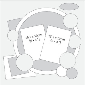
This is my new DT reveal for August 30th, Sketchabilities Sketch #54. This was a fun sketch to work with because I love designing with circles. I used  the new Echo Park Victoria Garden paper. I mainly used blues and greens although this EP line is mainly pink.


Thank you for visitng my blog
Keren

Sunday, August 28, 2011

Beauty

This is another layout using the Basic Grey Hello Lucious papers.  I used some Dusty Attic pieces and some Petaloo flowers. I used the first sketch from My Creative Sketches. I also use Palette #73 from The Color Room.


Thank you for visiting my blog
Keren

Thursday, August 25, 2011

Born in our Heart

Basic Grey has started a new blog and has a Design Team call. I was really excited when I saw this. Although its a long shot, I'm applying with the hopes that they take some blogger newbies like me. As soon as I saw this I grabbed my Basic Grey paper and made a layout just for them hoping to grab their attention. I really love how it came out. I used BG's Hello Luscious line. I made a punched border around the circle and decorated with different types of paper flowers all around. My favourite is the title. This is my most favourite picture of my kids and I wanted to find a meaningful title for this layout. "Born in our Heart" just ways it all!! "Not in my belly were you born but in my heart and in my soul!!"
I'm very passionate about scrapbooking and about the memories we pass on to our children. I can't wait until they see this page when they are older and feel the love I feel for them.


Thank you for visiting my blog
Keren

Wednesday, August 24, 2011

Suds and Smiles

This is a layout I made for the Dusty Attic August Sketch Challenge. I had these pictures of my daughter in the bathtub and I used the flourishes to resemble water dripping out of the shower. For the background, I used a mask and painted over it with gesso. Then I took some DA flourished corners and cut them up to separate them. I painted them white and added glossy accents to make them look like water. I also used some circle chipboard and painted it white. I then added clear Stickles to make them look like bubbles. I like the different techniques I used on this layout.  I love to experiment with different mediums.


Thank you for visiting my blog
Keren

Tuesday, August 23, 2011

Father

Here is a layout I made for the August sketch challenge at Get Picky. I used a large chipboard key that I've had for years. I sprayed it with a bronze Tattered Angels and then added crackled accents to make it look antique. I then darkened the crackle with brown chalk ink. I used Tim Holtz grunge hinges and a lock. I painted it with brown crackled paint. Finally I added 2 broken jewelry pieces. One broken earring and a necklace charm. I also used a metal key and a Tim Holtz F token.  I also used a Prima recycled packaging so I can enter this layout for the Scrap for Help August challenge. The theme for this challenge was Fathers and you must use recycled materials.
I like the grungy, vintage look of this page. I tried to make it look like an old wooden door with a rusted lock and hinges!! I used crackled paint on the whole background to make it look antique.


Thank you for visiting my blog
Keren

Sunday, August 21, 2011

Live and Love

I can't say it enough: I love this Kaisercraft paper. Its called Gypsy sisters and the pattern reminds me of something mystical. I love the combination of this purple with the aqua blue they just goes so well together. I really love Kaisercraft papers. I used this beautiful background but I also cut some swirls out of the matching papers and added it to the layout. I recently went on the Kaisercraft blog and found some fun sketch challenges to work with. Below is the sketch challenge and my layout. I also had another sketch by Stuck? sketches that looked so similar in elements that I combined the two sketches together into this layout. This was the first time I 've challenged myself in this way but it came out better than I thought. I also realized that I used the word LOVE again on a layout. Since its such an easy word to use I wanted to uploaded onto the Bird is the word Love Challenge.
Finally I used for the first time a palette from The Color Room. I've never combined their colours on a palette before. I thought it would be fun and I finally put my mind to this challenge. See Palette #72 below.
I can't believe how I challenged myself this time!! I love it!!


Thank you for visiting my blog
Keren

Friday, August 19, 2011

All you need is LOVE


Love, Love, Love.
Love, Love, Love.
Love, Love, Love.

All you need is love.
All you need is love, love.
Love is all you need.

These are the most important words. No other words are needed. I designed this layout for two Challenges. The first on is based on a Sketch by Nadia at Once Upon a Sketch. The Journaling criteria for this challenge was to use words from a song. I chose the song above because I love the simple but truthful lyrics. The second blog is Bird is the Word. The word to use for this challenge was of course LOVE. I just love the combination of these two challenges together. I used these new papers by Echo Park called Victoria Garden. I cut lots of roses and framed the picture with them I also used a Dusty Attic chippie to frame the photo.


Thank you for visiting my blog
Keren

Wednesday, August 17, 2011

Family- GDT for The Paper Variety

Here is also my reveal for the Guest Design spot at The Paper Variety since I was their featured winner 2 weeks ago. This blog has weekly thematic challenges and are always very different.  The challenge this week was to use threads: it could be yarn, ribbon, floss, twine or sewing thread. I used some floss to sew a ripped piece on my layout. I also used some lace trim and ribbon. I threaded the title Family through the ribbon to add effect to the theme.


Thank you for visiting my blog
Keren

Life's a Beach- GDT for My Scrapbook Nook

This is my Guest Designer Layout for My Scrapbook Nook. I was invited last month to feature my layout on the August Sketch Challenge after winning their July sketch contest.
I like the sketch challenges at MSN because they are usually different than my scrapbooking norm. I feel challenged because I have to use a lot of white space which I'm not used to in my layouts. I really like how this beach layout turned out. I used fish netting and some fake shells to give it a beach feel. I used lots of turquoise colours and even sprayed glimmer mist over the netting so I can use it as a background for my photo.


Thank You for visiting my blog
Keren

Monday, August 15, 2011

Father

I'm really excited to show you this layout as its my craziest and most grungy one up to date. I was able to use so many embellishments and materials on this layout. I used the sketch below for a challenge at Our Vintage Affair. The theme of the challenge was birds. I like my 3 blue birds because they fit this theme. The two birds on the cage remind me of my two kids and the bird flying on top is their father protecting them. Therefore what better title than Father.  I used a picture of my husband with our 2 kids because Fathers was the theme at the challenge blog Scrap for Help. Although this is the first time participating in one of their challenges, I'm very impressed with this blog.  Not only are the founders doing it for the love of Scrapbooking but they are also raising money for charity. I don't think there is a better way to do it or a better cause. The main challenge of this blog and it must be in every layout is to use recycled material on your creation. I'm very proud of the amount of recycled embellishments I used.

I rummaged for scraps all over my house and used them here on my layout. I used a piece of cardboard and a piece of burlap as backgrounds. Then I sprayed them with Tattered Angels mists as well as, the whole page.  


Then I found old broken necklaces and charms, coins, a button and a bottle cap. I also used a lot of old scrapbooking metal embellishments that were just sitting at the bottom of my box.


 I used Turquoise stickles on the birds.

And crackle accents on the frame, the photo and the background to give it a vintage-grungy look.


Finally I really like the feather accent that I added. Not only does it follow the bird theme, but it's also a soft accent to the grungy/metal look of this layout. It acts as an antagonist.


I really enjoyed trying out all these mediums and techniques. It was so much fun!!!


Thank you for visiting my blog
Keren